Package Design [2024]
LocationMelbourne-Naarm
[AUS]
[AUS]
SectorOphthalmic
Pharmaceutical
ServiceBrand Identity
Industrial Design
Package Design
Delivered is a full visual identity and sustainable packaging system, replacing plastic blister packs with biodegradable and recyclable materials. The result is a unified brand that reimagines vision care through lifecycle thinking, usability, and waste reduction.
[01]
Brand Identity
Clearspace
Palette
[02]
Industrial Design
Sketches
A corrugated cardboard prototype was built to test the functionality of the dispenser. Opening and closing tabs proved effective for refilling and dispensing, resulting in a secure package.
[03]
Package Design
3D
Renders
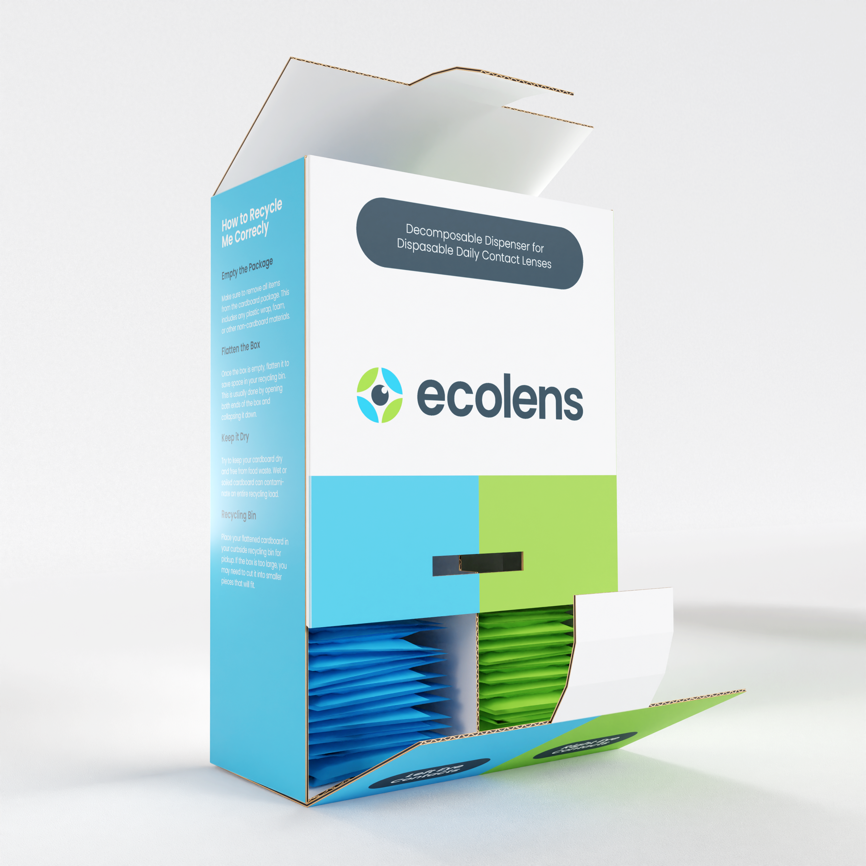
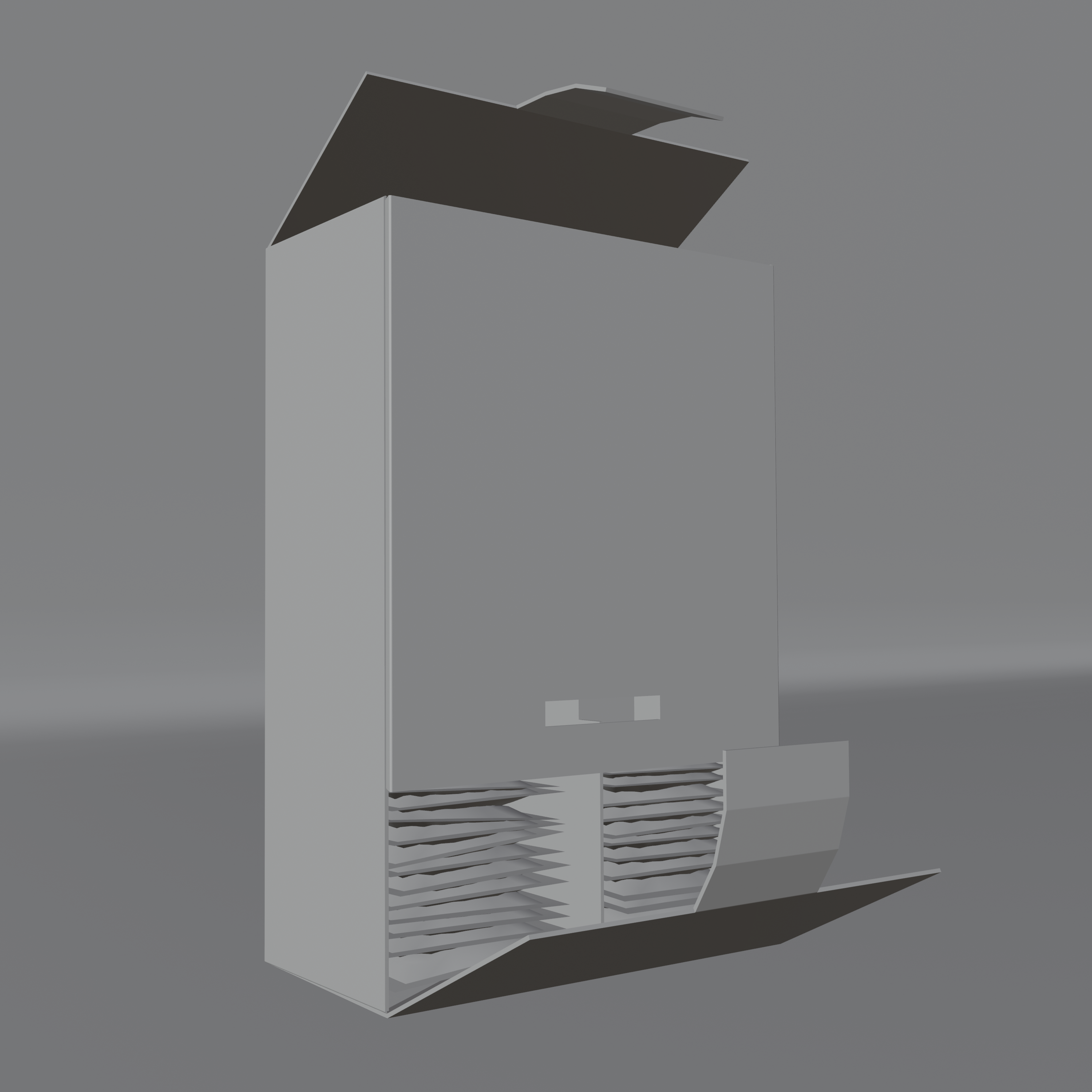
The renders highlight Ecolens’ practical and sustainable design. Its compact rectangular form maximises efficiency in storage and transport, reducing spatial waste and carbon footprint. Vibrant colour, clear text, and balanced visuals reinforce retail appeal, while the dispensing system is shown through bottom access tabs and top refill tabs, illustrating usability, refillability, and lifecycle across filled and empty states.
Dieline
The dieline details the cardboard box, divider, and lens packs with cut/fold lines and a 15 mm bleed. Minimal soy-based ink and selective colour enhance sustainability, while natural cardboard provides a clean finish. Folded dimensions are 1500 mm (H) x 1000 mm (W) x 500 mm (D), with medical information, recycling instructions, and colour-coded panels included for clarity and accessibility.
3D Tools

